
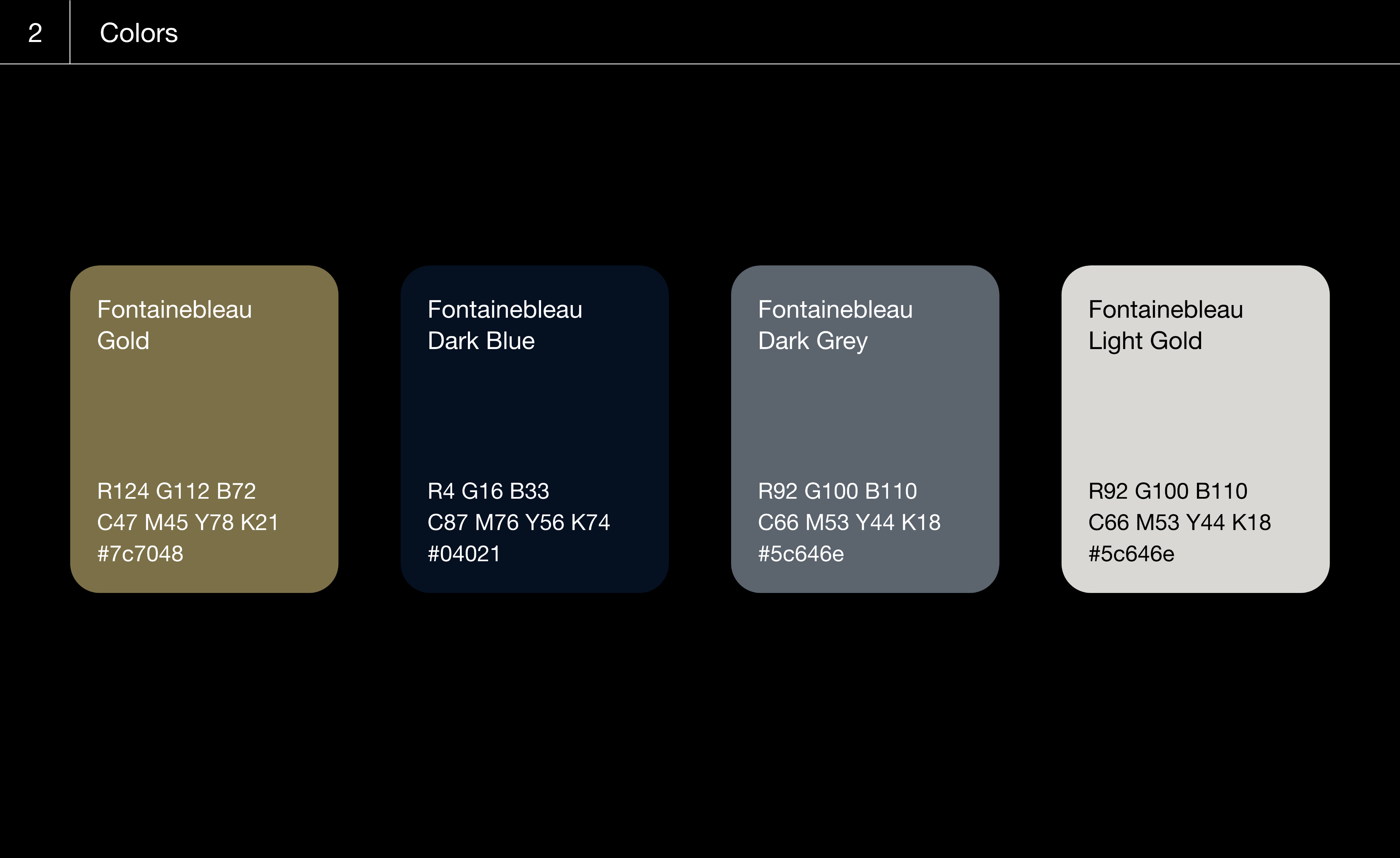
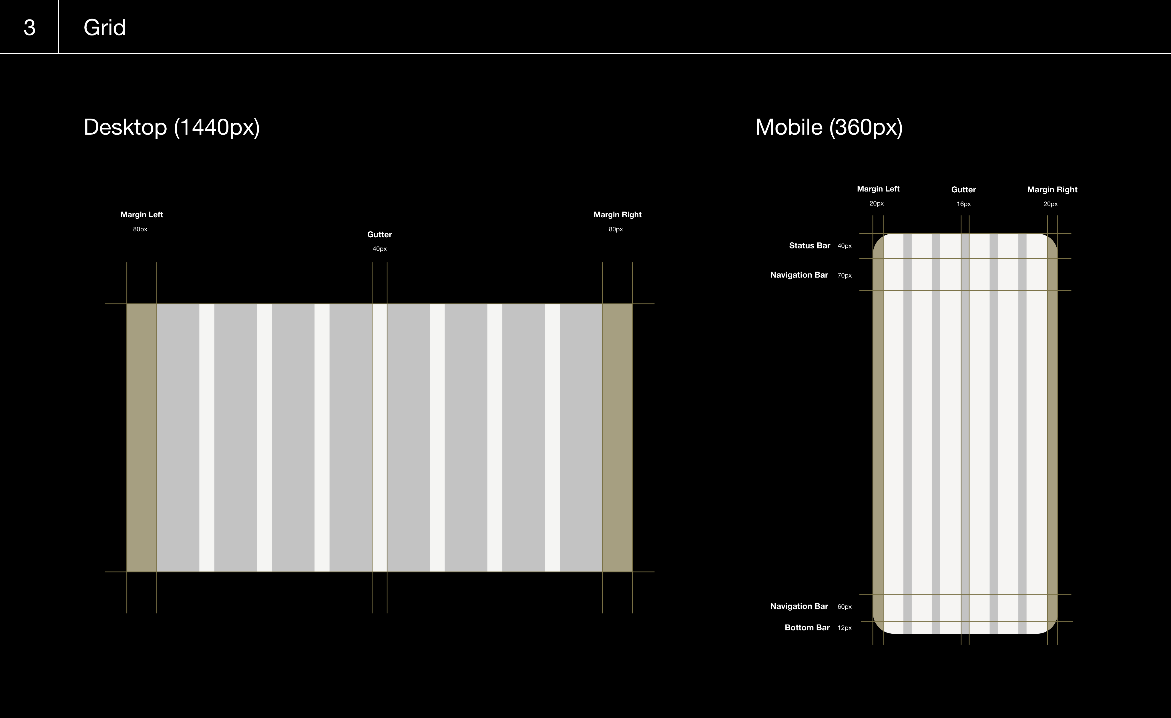
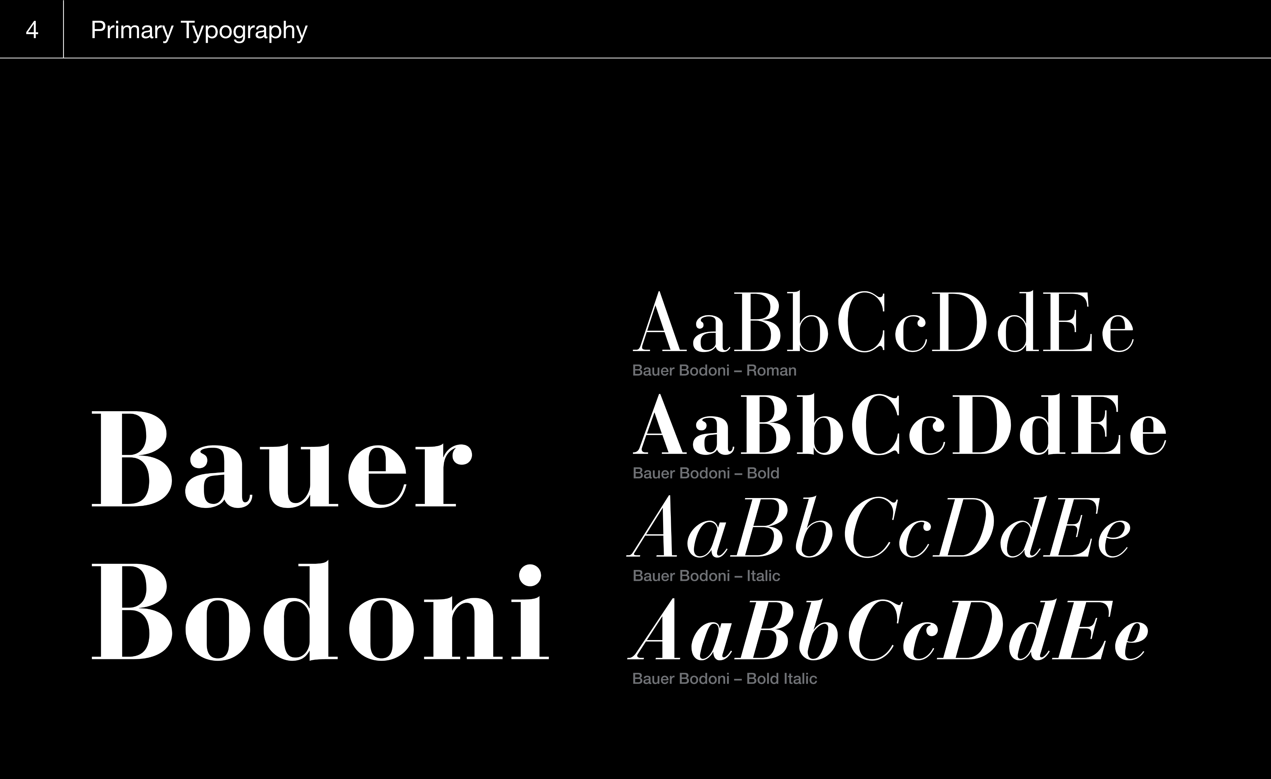
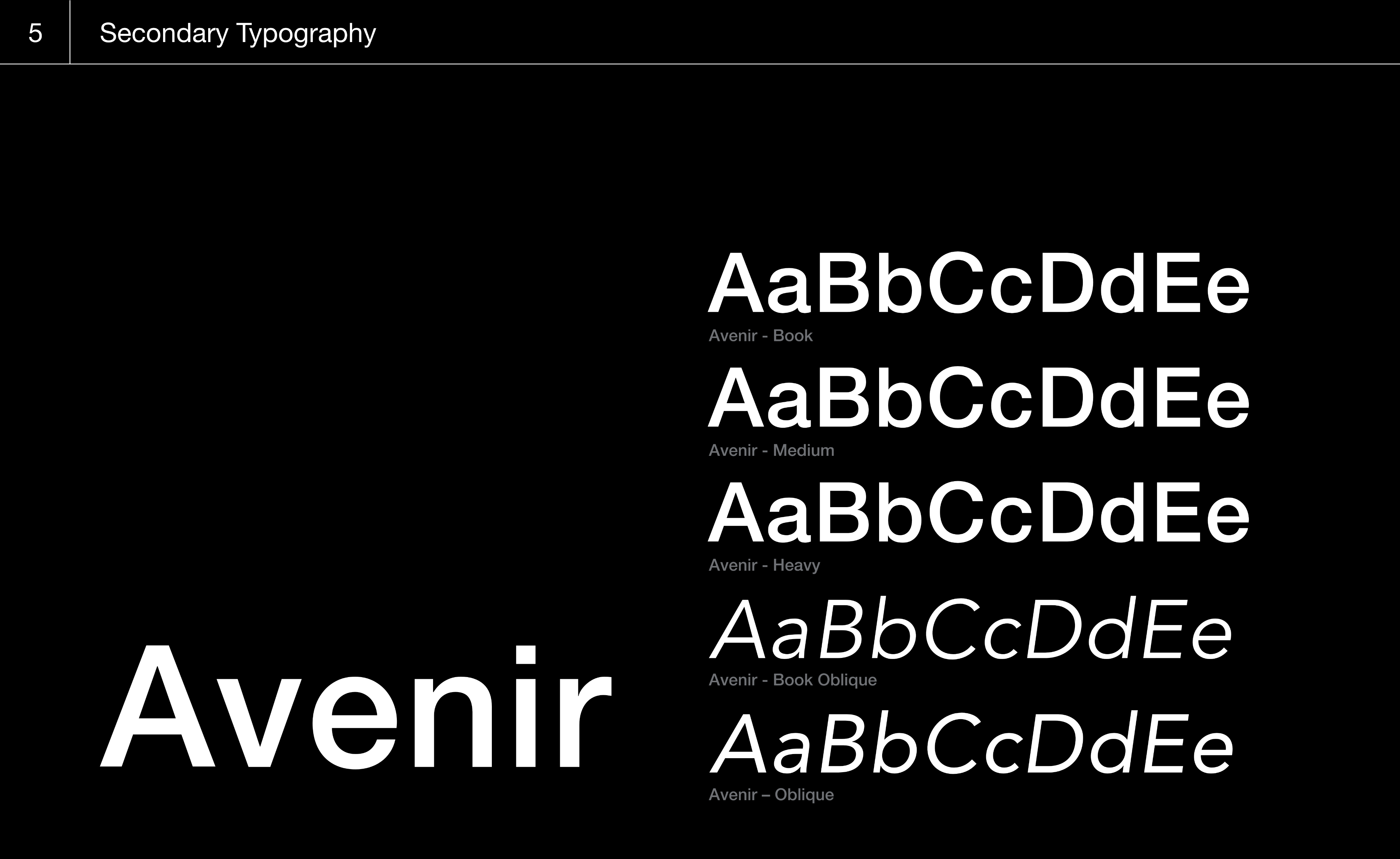
Design a complete design system for the Fontainebleau brand to ensure consistent visual identity across all platforms and materials.
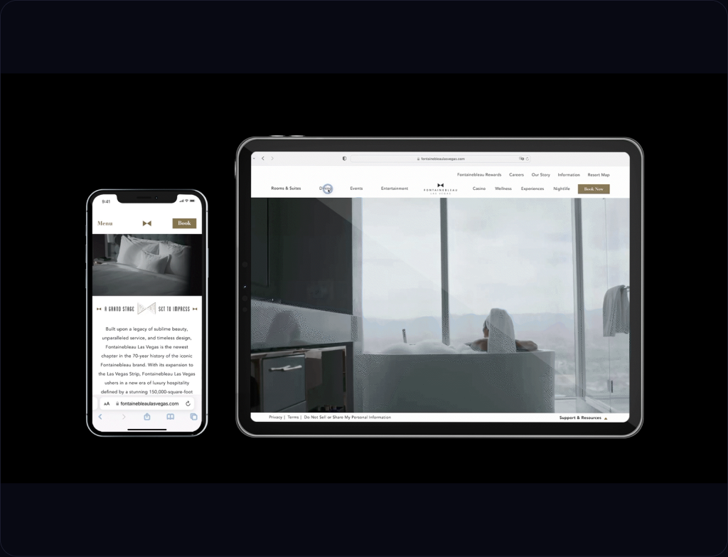
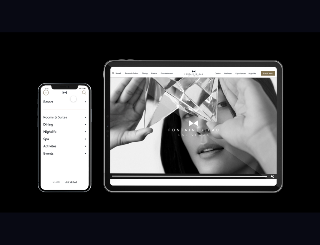
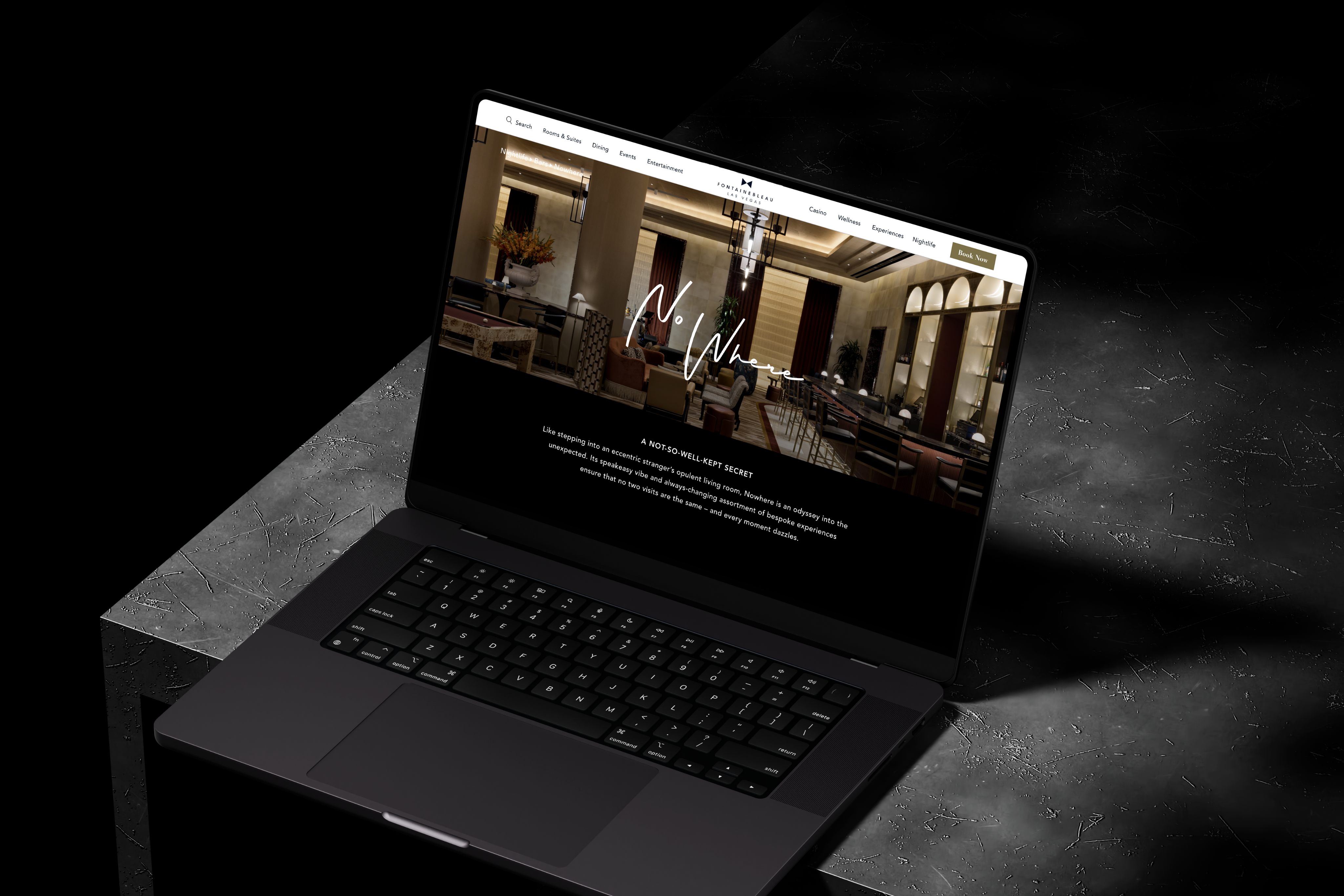
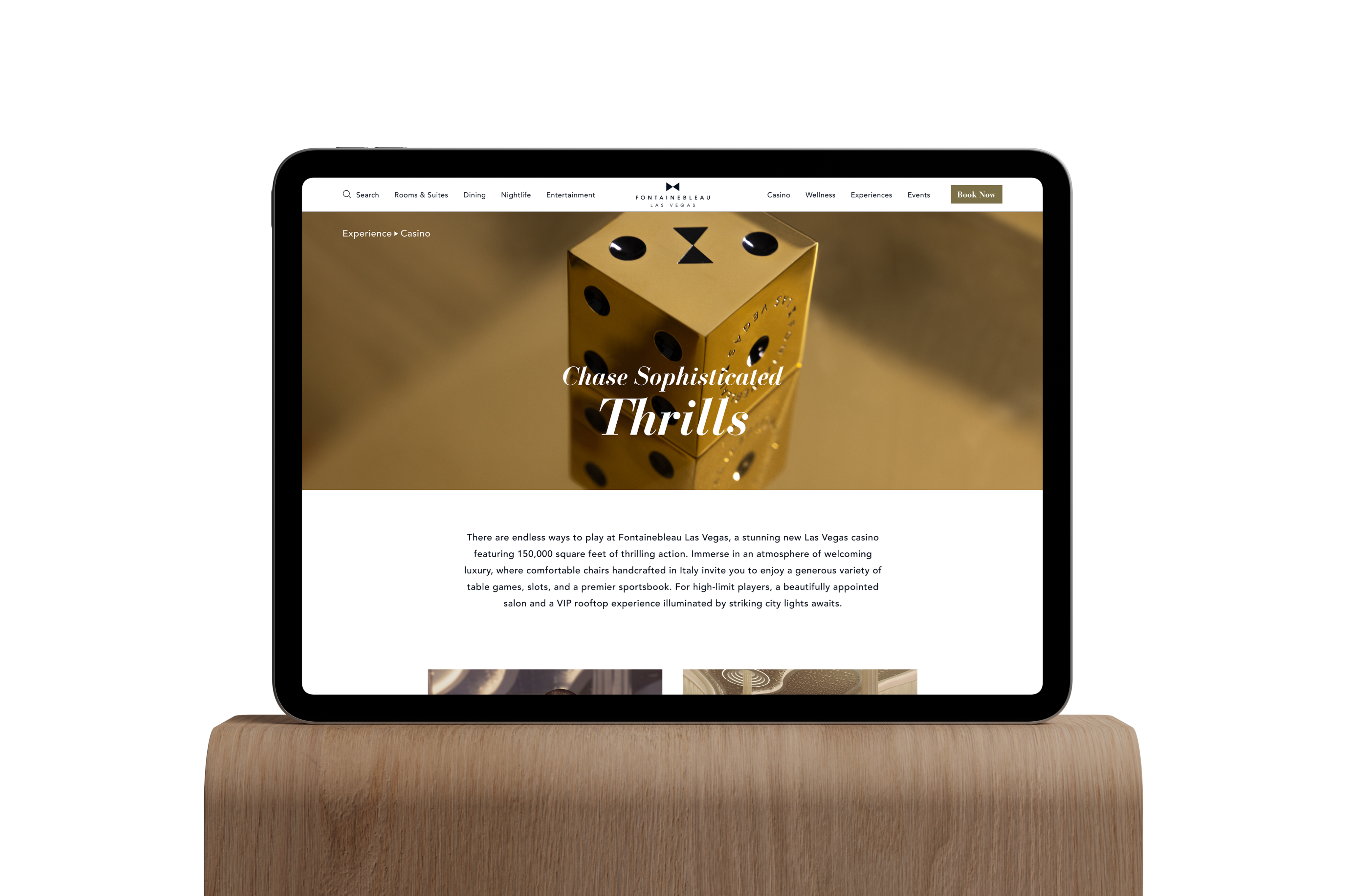
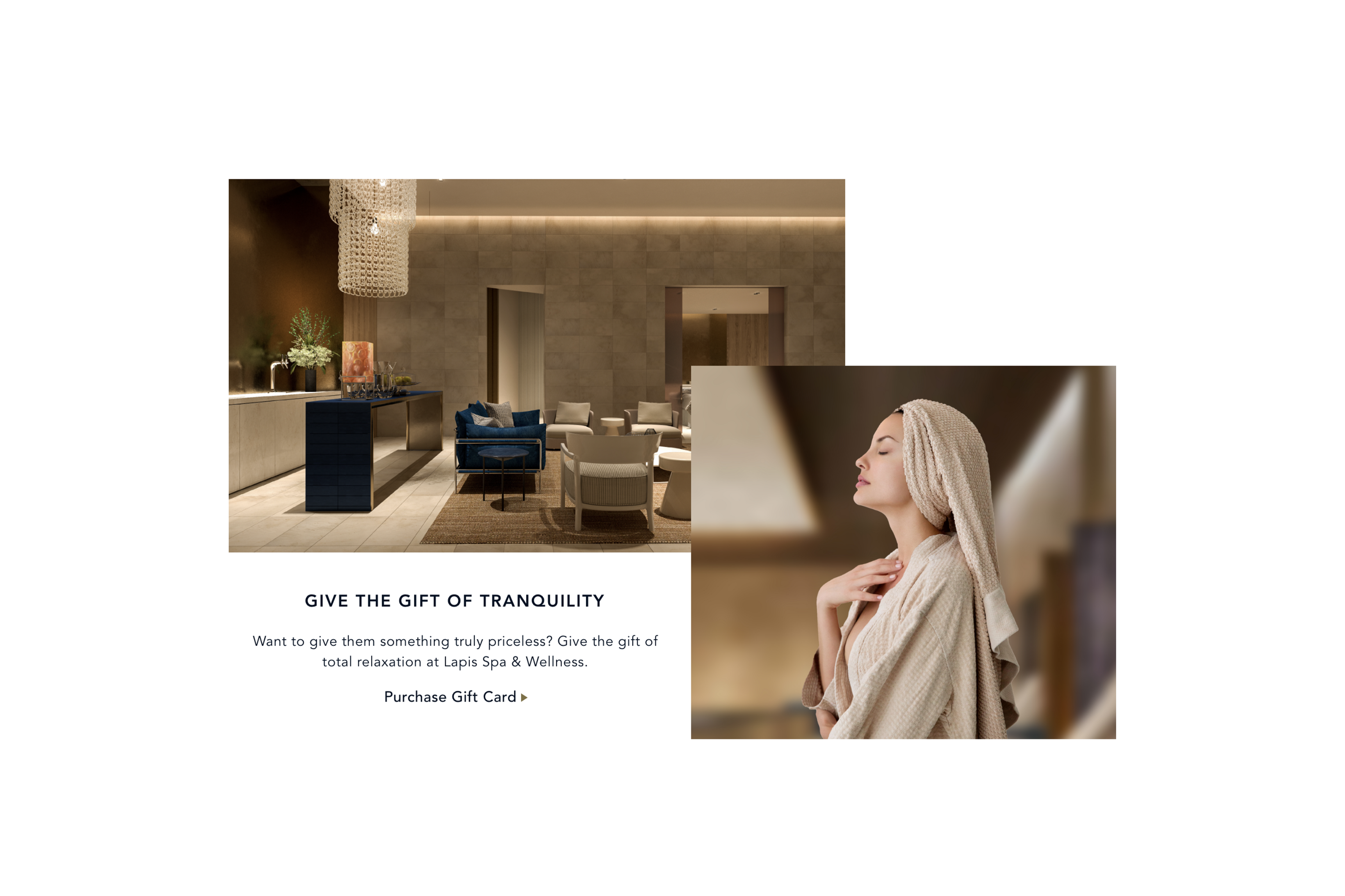
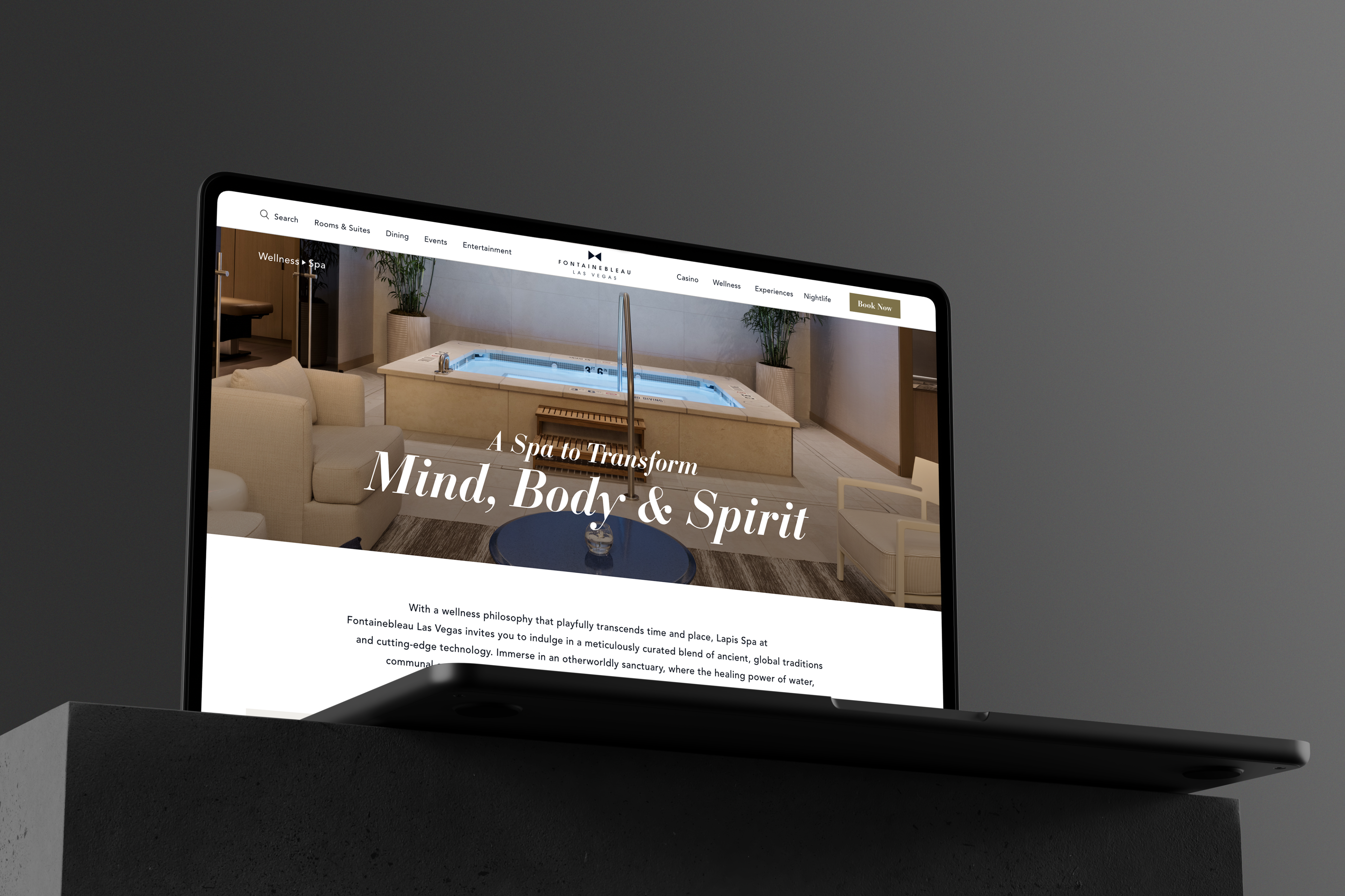
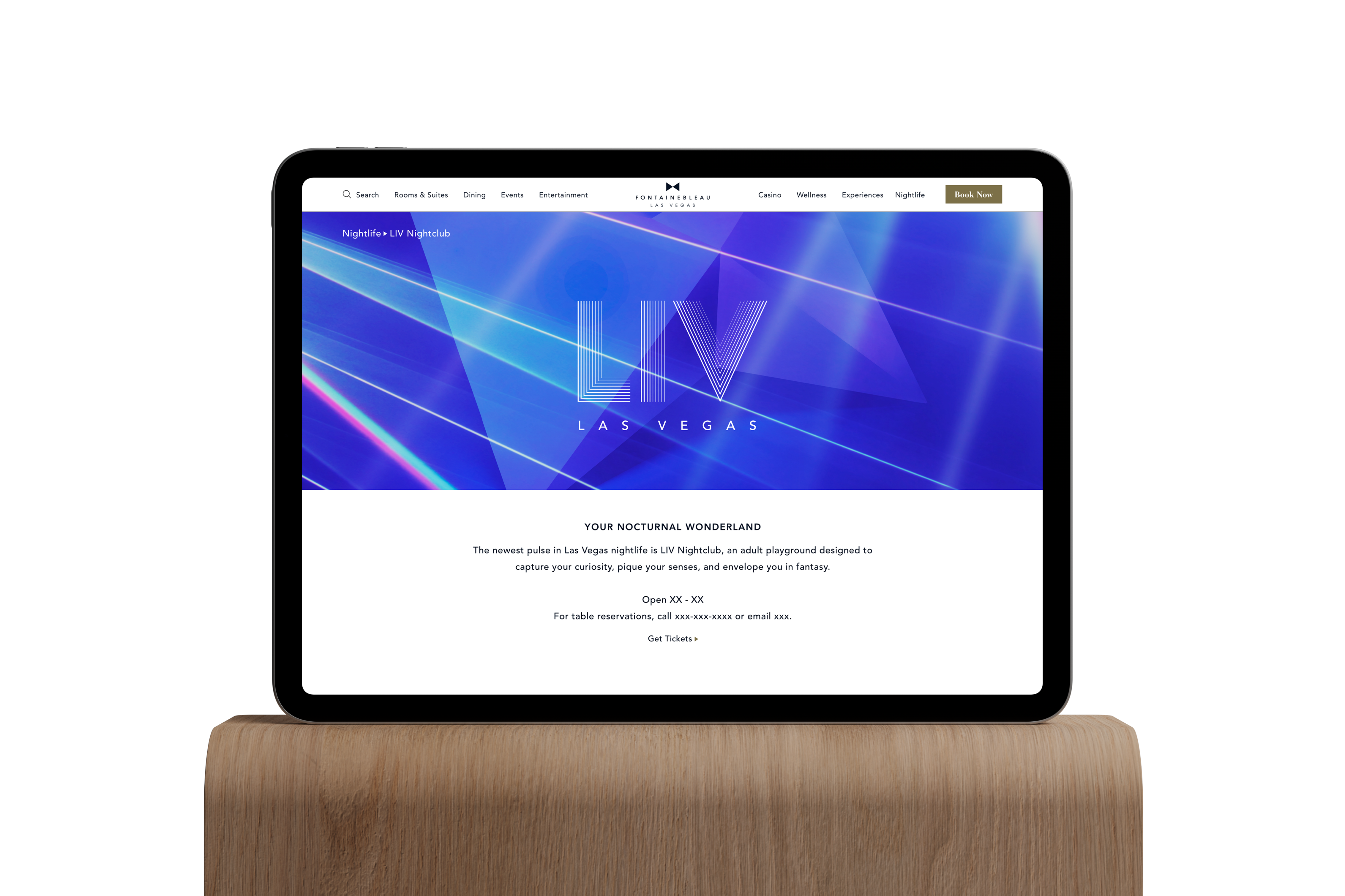
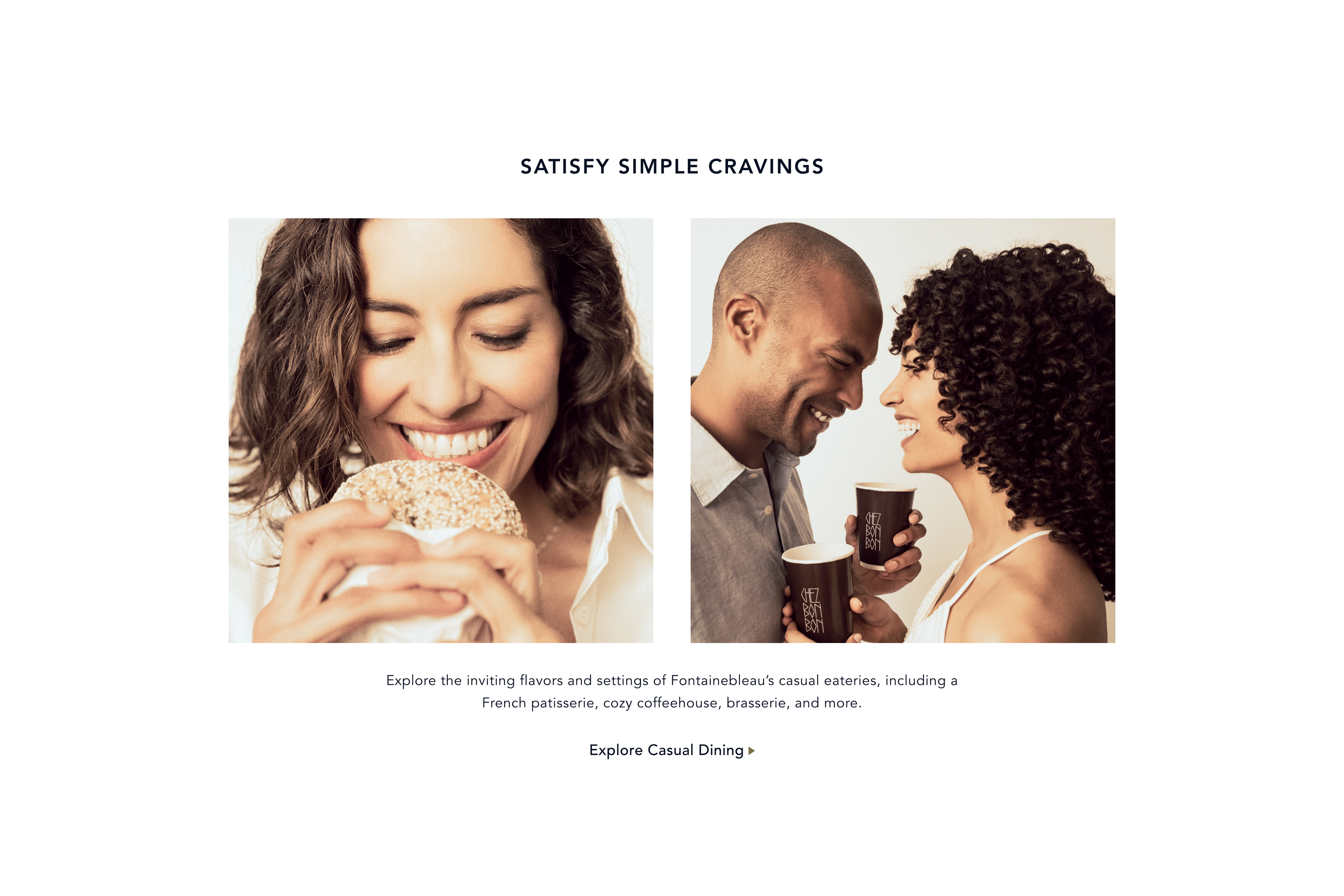
Redesigned the hotel website with a refined, luxury-driven visual language, elevating the brand identity through thoughtful and intuitive user experience design
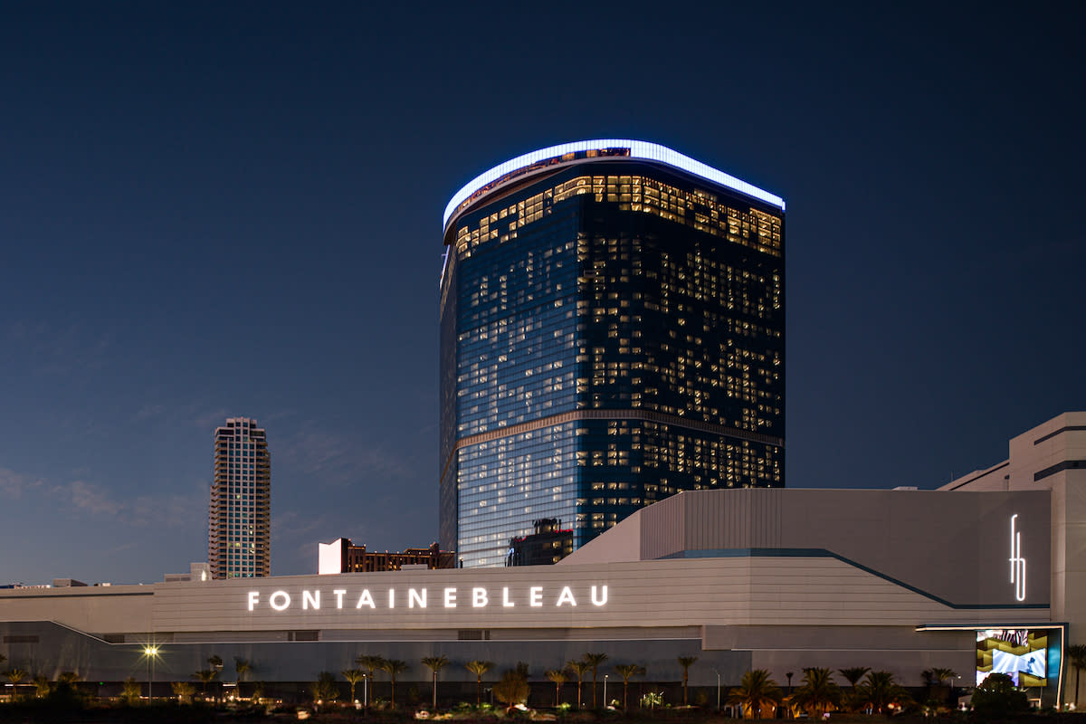
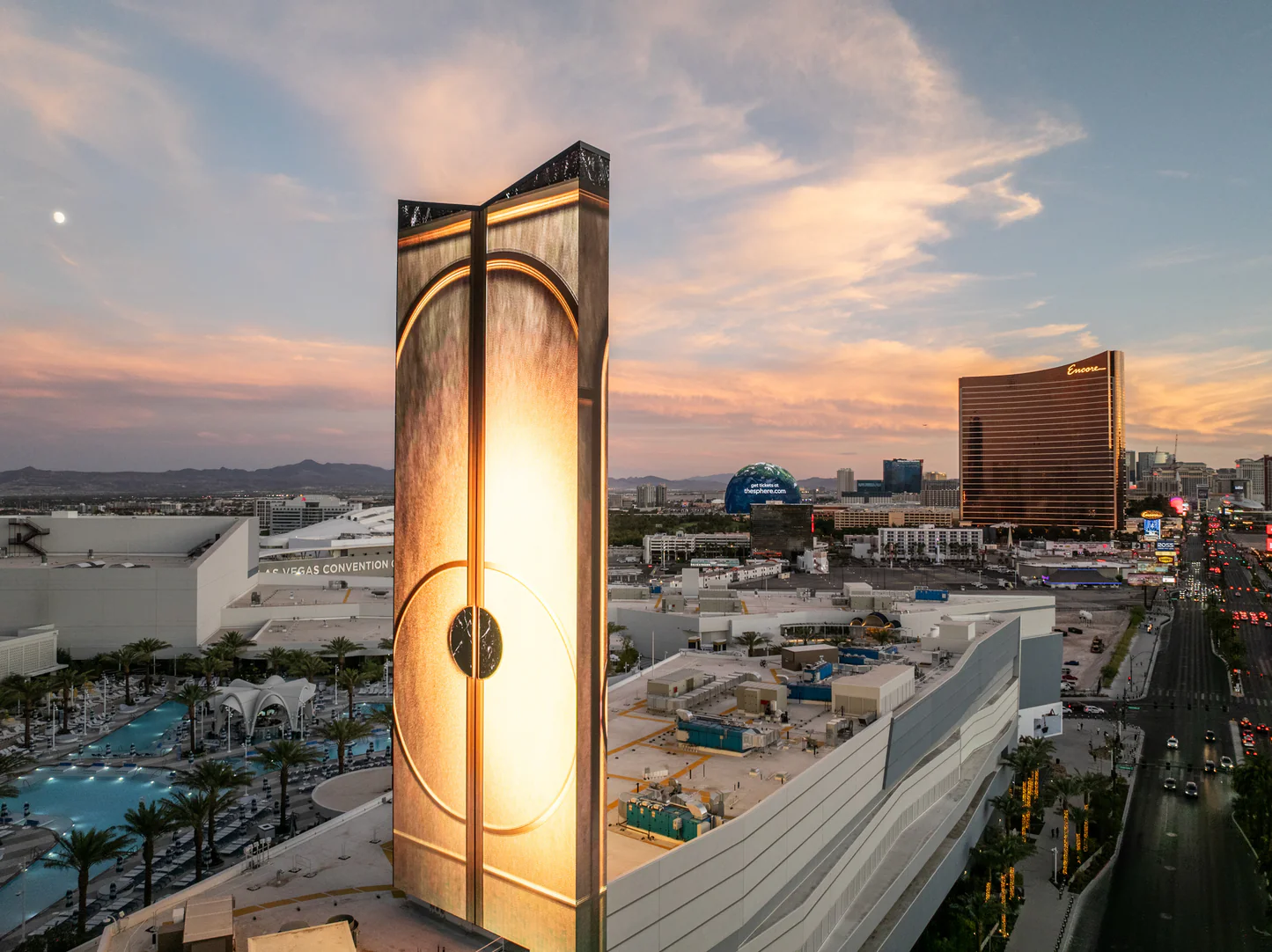
Fontainebleau Las Vegas is a luxury resort located on the north end of the Las Vegas Strip. Opened in 2023, it brings the iconic Fontainebleau brand from Miami to Las Vegas, combining modern design with high-end hospitality.
Design a complete design system for the Fontainebleau brand to ensure consistent visual identity across all platforms and materials.

Reduce unnecessary steps and streamline navigation to create a faster and more efficient experience
Provide detailed and intuitive information for each service to help users make confident decisions

Allow users to compare multiple options in one place, reducing the need to navigate back and forth
The guidance provided on the existing website is not sufficiently direct, leading to user confusion during the booking process.
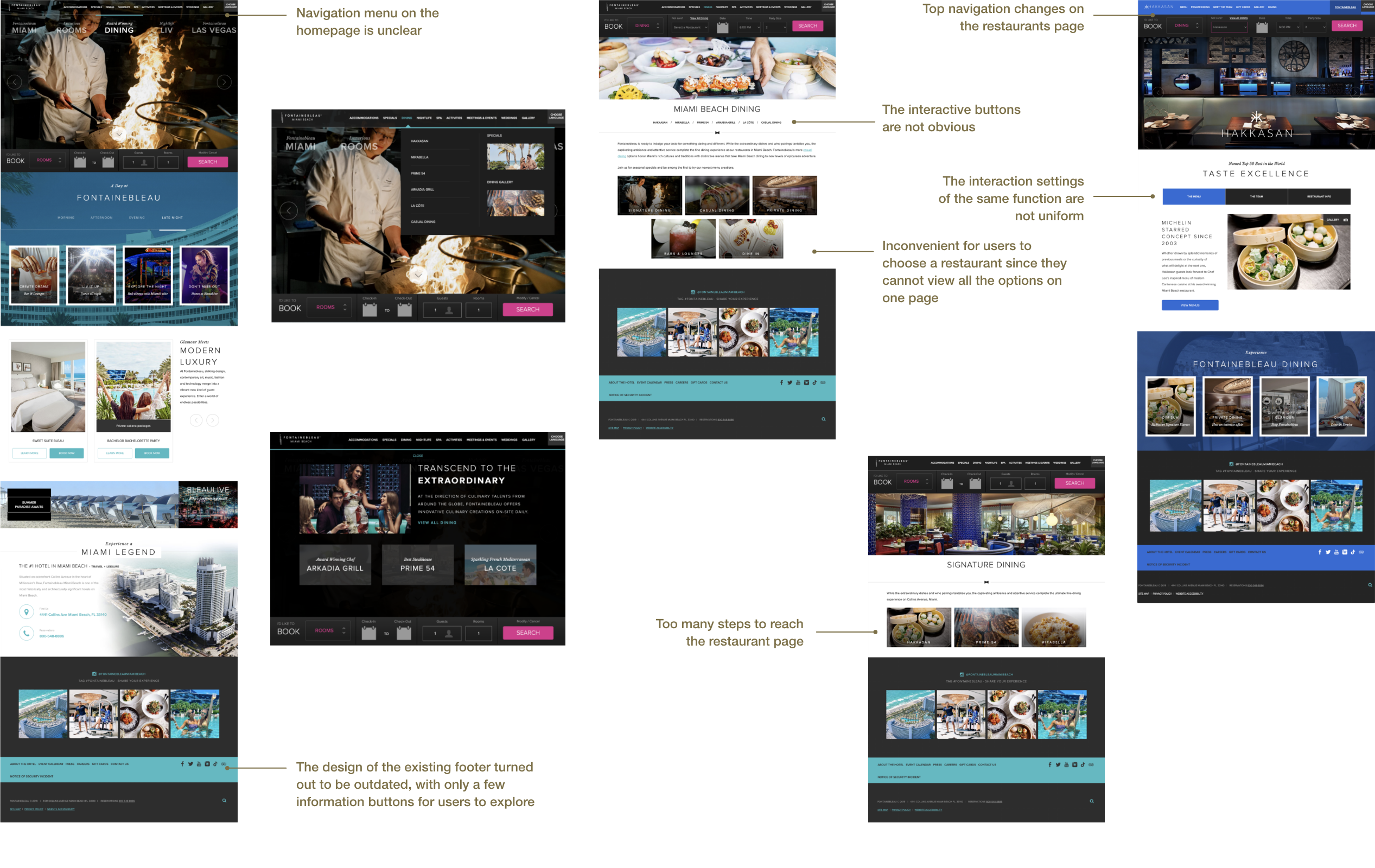
Customers were confused about where to begin on the homepage.
A brief introduction to the accommodation did not provide customers with an intuitive idea, as there was no detailed page for each room. As a result, customers often booked rooms that differed from their expectations.
80% of customers expected to see a grid displaying all options on the same page, rather than having to navigate back and forth to compare different options.
Users struggle with unclear entry points and fragmented navigation, making it difficult to begin and complete the booking process efficiently. Overall, a lack of clarity, visibility, and information depth increases cognitive load and leads to confusion and mismatched expectations.

Features that are industrial-standard or validated in research

Potential opportunities that makes the experience better

Features that are seen in other products nevertheless cause harms
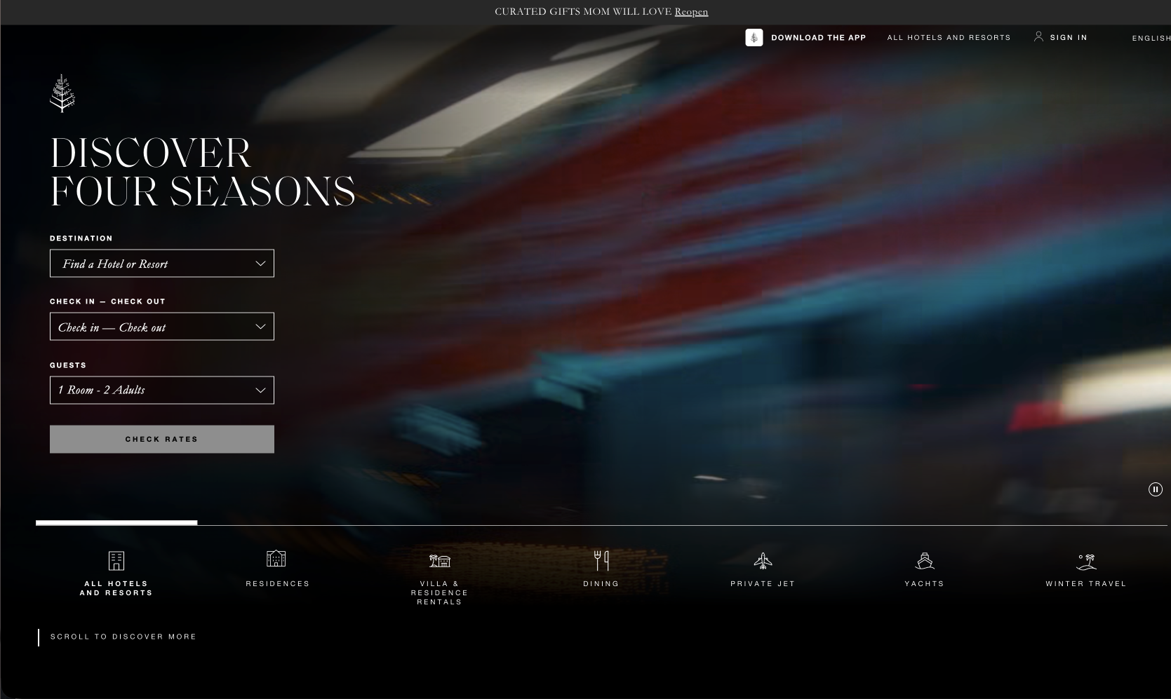
I conducted a competitive analysis of leading luxury hotel websites, including Four Seasons, MGM, and Wynn. Each platform targets different user expectations—from premium storytelling to efficiency-driven booking—revealing key trade-offs between inspiration, usability, and conversion.
Summary
Four Seasons emphasizes high-end visual storytelling and brand experience, creating a strong emotional connection with users. However, the booking entry points are less prominent, and navigation can feel indirect, which may slow down decision-making and reduce conversion efficiency.
Summary
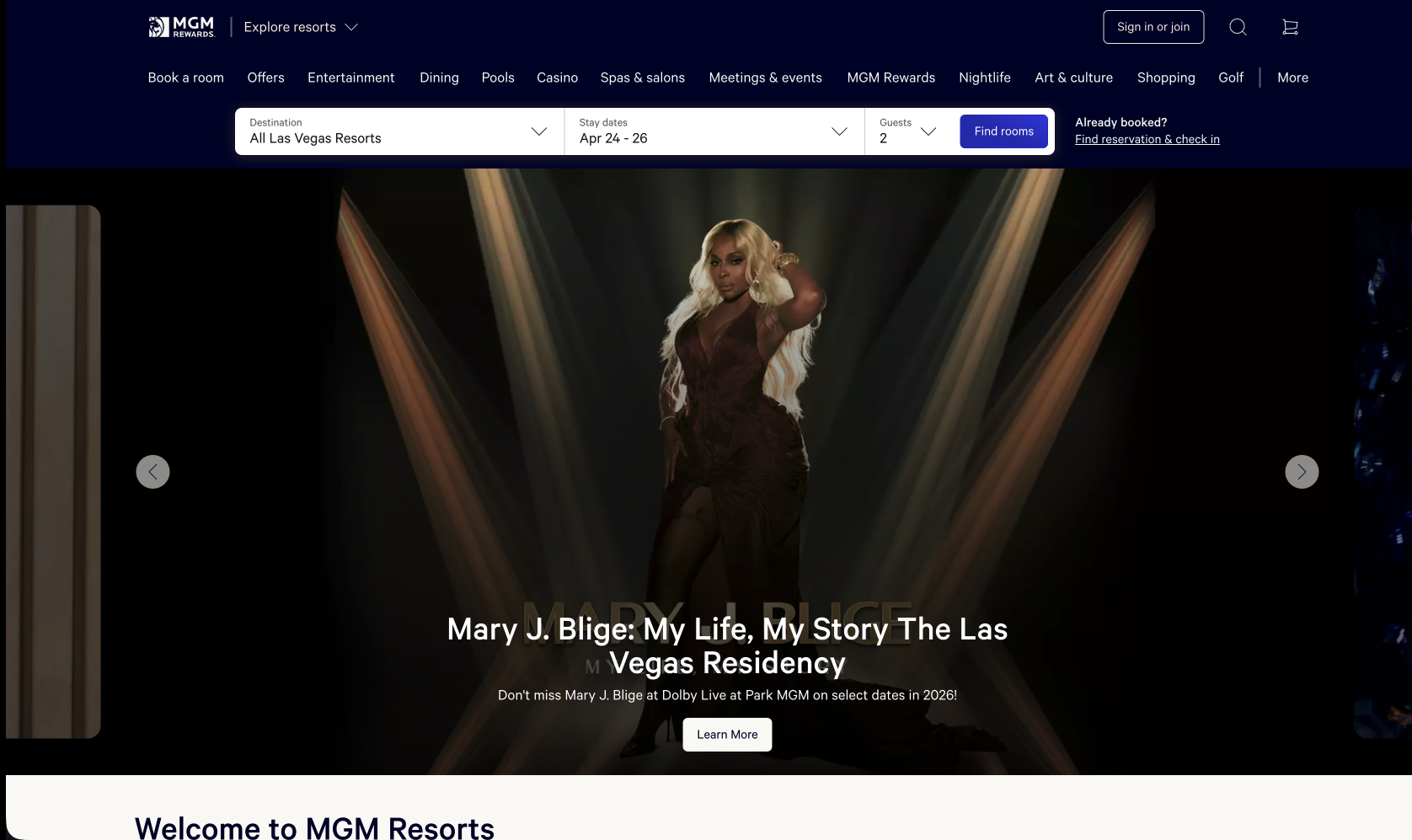
MGM focuses on efficiency and functionality, offering clear booking pathways and structured information. While effective for quick decision-making and conversions, the experience feels more transactional and lacks immersive brand storytelling.
Summary
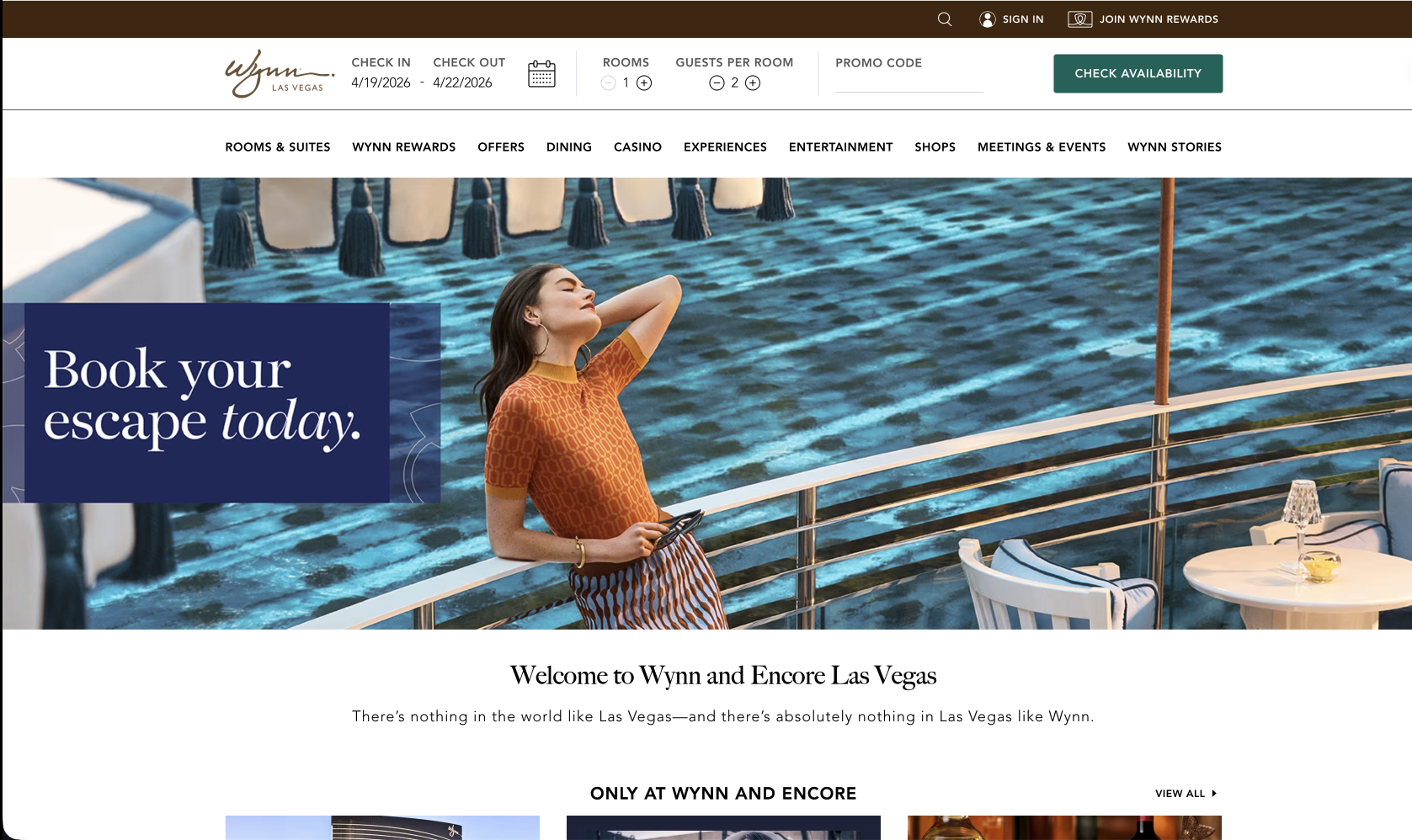
Wynn balances luxury branding with usability, combining visually rich content with relatively clear navigation. It supports both inspiration and booking efficiency, though some interactions and information hierarchy can still be refined for a smoother user journey.
Our customers need a simplified and intuitive experience to efficiently find the information they require during the booking process.
We added filtering options based on room preferences to facilitate quick narrowing down of choices, along with max/min options to offer a broader range for customers to view the entire page. Simultaneously, we streamlined the restaurant selection flow from 5 steps to 3 steps.
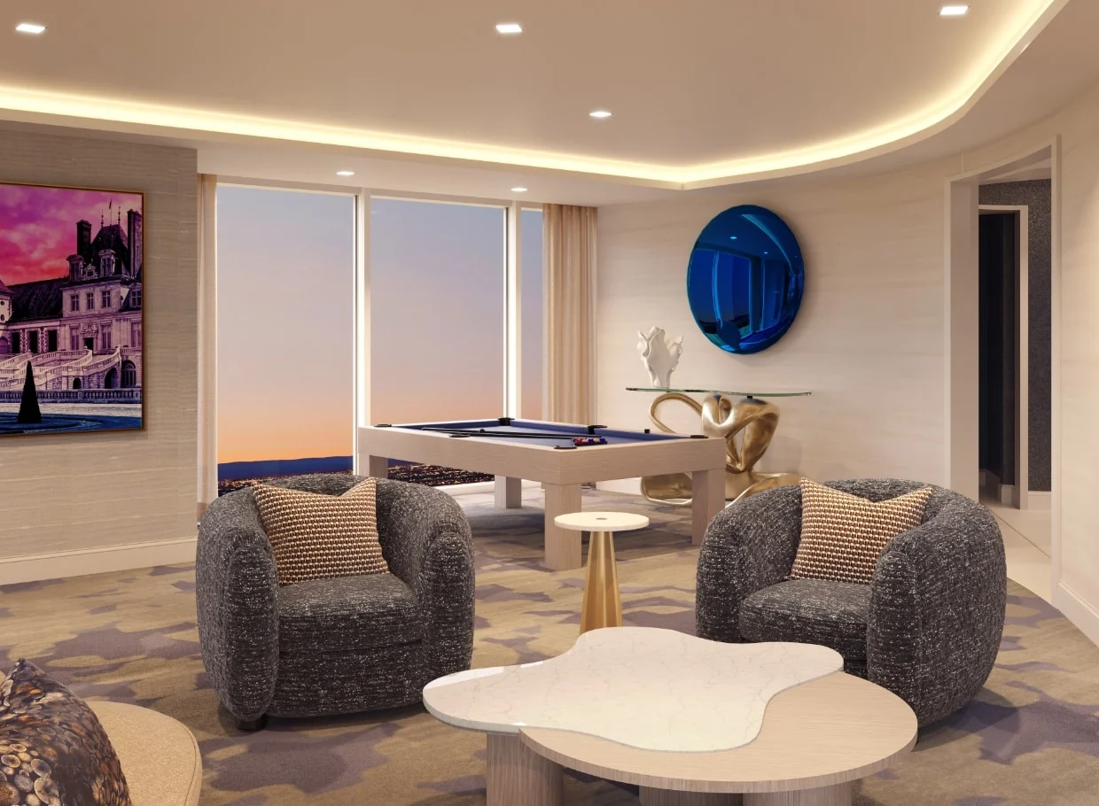
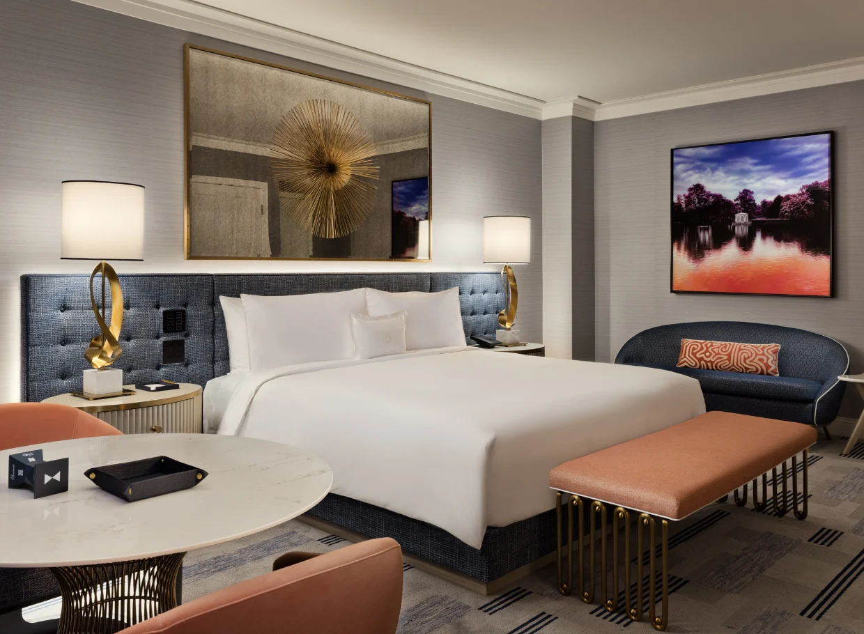
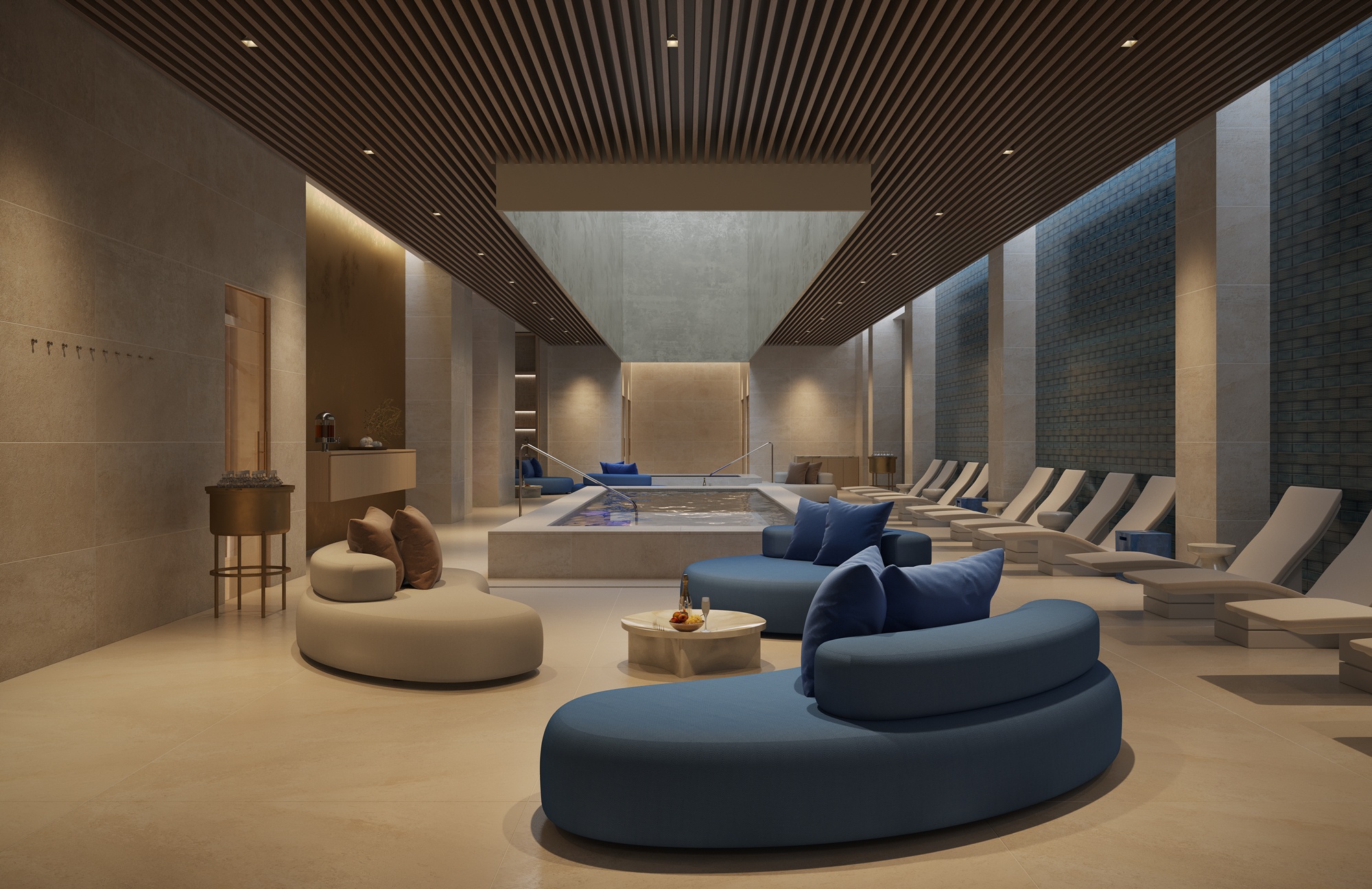
We provided floor plans and virtual tours, including 360-degree views of accommodations, facilities, and amenities, to offer customers a better understanding of their options before making a decision.
By adding a search bar at the top of the navigation to allow customers to search for specific services or amenities they need. This feature significantly enhances the user experience, making it more streamlined and user-friendly.
Reduced booking time through a streamlined and intuitive user flow.
Increased daily active users by over 70% due to improved usability.
Enhanced service efficiency and experience led to higher customer satisfaction.